Dental print ads: How to Make a Lasting Impression

Dental print ads are one of the oldest, and most effective, ways to attract new patients to your practice. While most of the attention is on digital marketing, there are still opportunties for an effective, targeted print ad. Dropping a page into the “best dentist” issue of your city’s magazine, or buying an ad in a new movers guide to your community can support your practice’s brand awareness. But to get the results you’re looking for they can’t just be good… they need to be great.
What does it take to create a print dental advertisement that not only makes a lasting impression, but gets results? There are four elements things you absolutely need to make your ad stand out.
Great visual
People’s attention is naturally drawn to visuals, so the image you choose for your ad is very important since it is the first thing to catch their eye. The biggest mistake people make with dental advertising is using images that really serve no purpose. Make sure the photo (or illustration) you select does one or more of the following.
Convey meaning
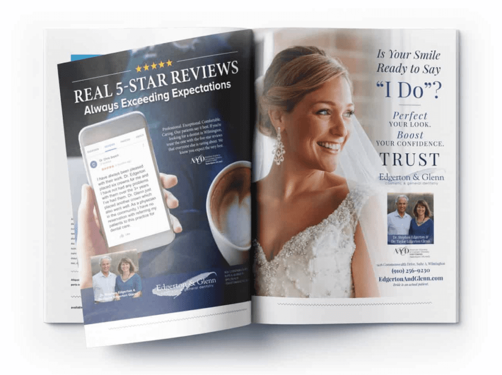
Too often, dental practice advertising contains generic, stock images that essentially just “fill space.” Many skimmers won’t take time to read the content of your ad, but a well-chosen image can express an idea or emotion with just a quick glance (even if it’s not worth a thousand words). That’s why some of the best dental ads use custom photography.
Grab attention (and direct it)
Your ad will be on a page competing with a lot of other content and a lot of other ads. The right image can (and should) stand out and get the attention of the reader.
Once you do have the reader’s attention, the right photo can also direct their eye to what you want them to see next, which is usually the headline. When you see ad photos with the eyes of a person looking in a certain direction (like the bride below), now you know why.

Great headline
Advertising legend David Ogilvy once said that “On the average, five times as many people read the headline as read the body copy. When you have written your headline, you have spent eighty cents out of your dollar.”
Your headline is indeed the first thing (and sometimes only thing) that will be read in your ad. The real purpose of your headline is to get people to continue reading the rest of your copy. To accomplish that, your headline needs to give your readers a few things in return.
Give them something of value
If there’s one thing people are interested in, it’s “what’s in it for them.” Your headline should convey the value you are offering, whether it is an opportunity to save money, get quality service, or receive some other benefit.
Give them a reason to be curious
You don’t have to give away your entire message in your headline, but you should share enough so that people feel compelled to learn more. Asking a question or making a seemingly shocking statement are two common ways of getting people to read further and learn more.
Great copywriting
If you’ve lured readers into your main content, congratulations! The copywriting for your dental print ads is what really converts your audience to new patient leads. There are a few techniques you can use to motivate them into taking action.
Focus on them, not you
It’s tempting to want to brag a little about your practice, but that’s not quite what your audience is looking for. They want to know how they will benefit, not what you are most proud of. You can still share the same information, just rephrase it with “you” instead of “we.” For example, instead of saying “we are open on Saturdays,” try rephrasing it as “you’ll find convenient appointments that fit your busy schedule.”
Be emotional
When it comes to making purchases, people decide with their hearts and validate with their brains. That means you can get a better response by appealing to their emotional side, rather than focusing on the cold hard facts. Pointing out how they will feel about visiting your office – whether it be safe, confident, welcome, appreciated, or something else positive – will encourage them to schedule that first appointment.
Great design
With all the right elements for your dental ad, it still has to come together in just the right way. A well-designed dental magazine ad will outperform one that is “thrown together” any day of the week. Here are a couple of the most important design guidelines to consider.
Use color (or don’t)
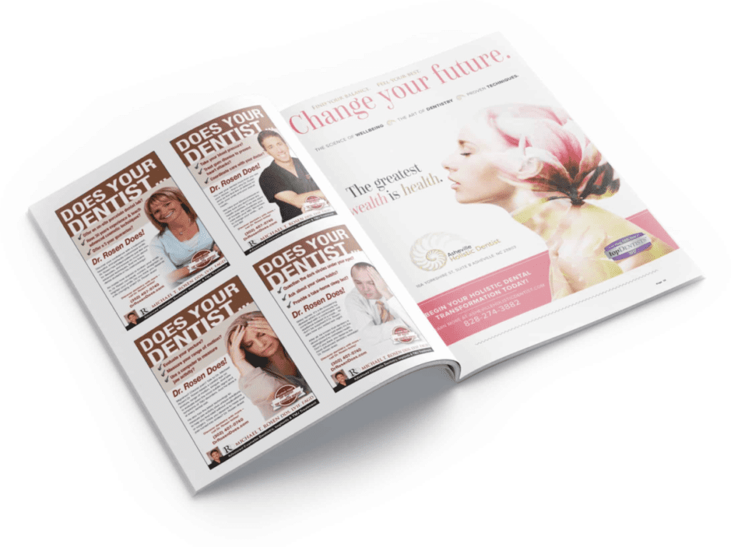
You’ll almost always have a choice between color or black and white ads. But remember that cost isn’t the only consideration when choosing. Color ads can help you stand out on a page and imply a higher sense of quality or status, but sometimes black and white can work better with your campaign theme, your messaging, or the type of visual you are using. When you do use color, make sure it aligns with your branding and your intended emotional response (there is a lot of psychology tied to color). The ad below on the right for a holistic dental practice does both with its calming, brand-centric color palette.

Give yourself enough space
Picking the appropriate ad size is also important. You want to be able to include everything you need to communicate in your dental advertising without trying to cram things in. Having plenty of “white space” in your ad gives the reader some breathing room and makes it easier for them to absorb all of the information you’re sharing without feeling bombarded.
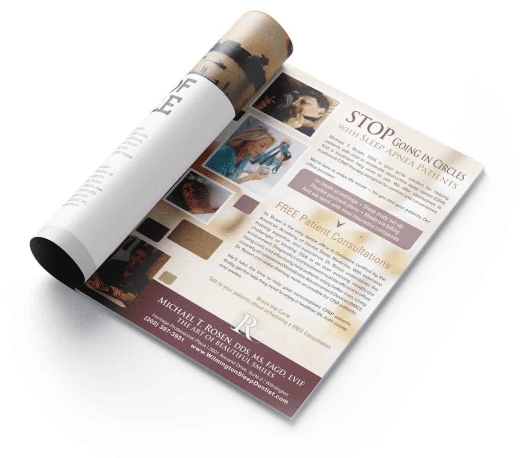
It’s a good idea to start with your content first, then pick your ad size and format. Not the other way around. Can you even imagine trying to fit the ad below into a half page?

Need ideas for offers to generate more leads?
If you’re looking for great promotional offers for your dental print ads that will get new patients to take action, download our FREE Dental Promotional Offer Idea Guide to find the incentives that will get new patient leads pouring into your dental marketing funnel.